OVERVIEWDuring my time at SnapMD, one of the projects I'm most proud of leading was the complete redesign of the patient experience. I worked with a mid-level designer and collaborated with our VP of product, design director, and dev and QA teams, to deliver a responsive patient-facing web app in less than a year.
CHALLENGEThere were a number of usability issues with the old patient UI that needed to be addressed to provide patients with a good user experience.
Some of the biggest problems included:
|
ROLELead product designer.
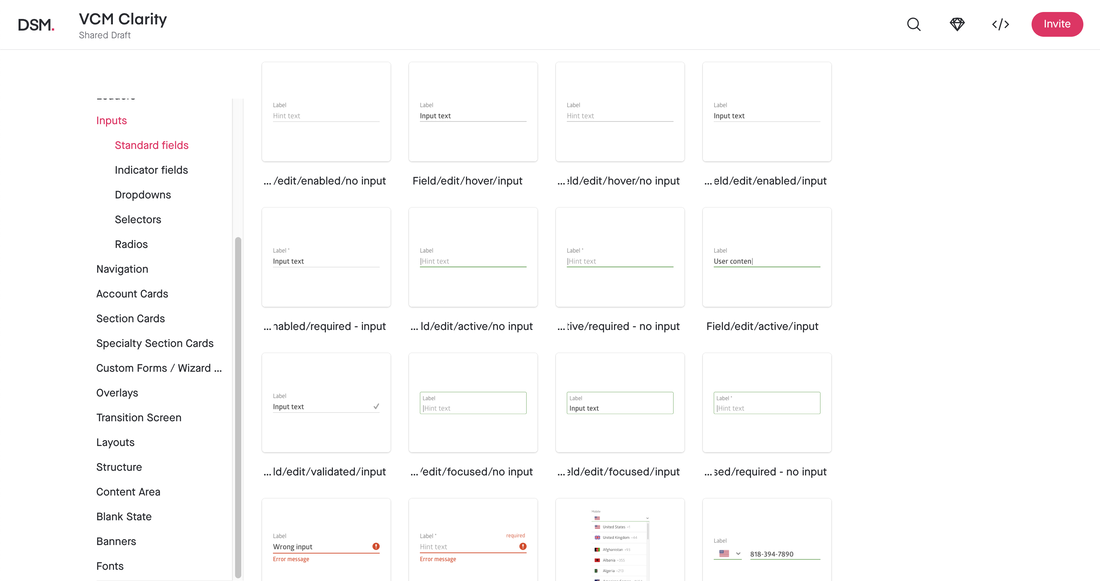
I created the design system for the patient UI from scratch, which shaped the patient experience on the platform. COMPANYSnapMD is the full-service Virtual Care Management (VCM) telehealth enterprise-level software, enabling healthcare providers to engage their patients via a comprehensive, secure, HIPAA-compliant, cloud-based telemedicine platform with powerful back-end systems to manage the digital health care continuum.
(Acquired by VirTrial, a Kinderhook Industries company in Oct 2019; then acquired by Signant Health in Nov 2020) |
Issues
Below are a few screenshots of the old patient UI, accompanied by explanations about some issues they presented. There were a lot more, but hopefully, these give you an idea of the types of problems we were looking to solve during the redesign effort.
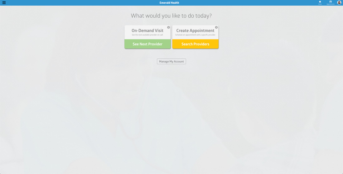
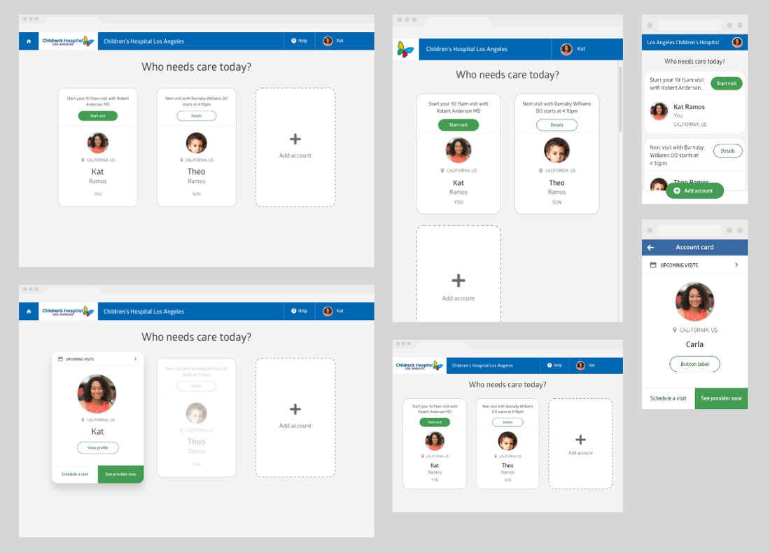
Confusing landing screen
|
When a patient logs in, this is the first screen they see. The buttons are very confusing; the labels and colors don't make much sense. This prompt also assumes that it's the patient logging in that needs to see a provider. It doesn't account for scenarios where one is signing in to make an appointment for a dependent as a primary action (e.g. mom with a sick baby).
In order to do that, the user has to click on the "Manage My Account" button, go to "Dependent Profiles," view that specific dependent's profile, and make an appointment from there....very hidden and one too many steps, especially for a mom with a sick baby! |
|
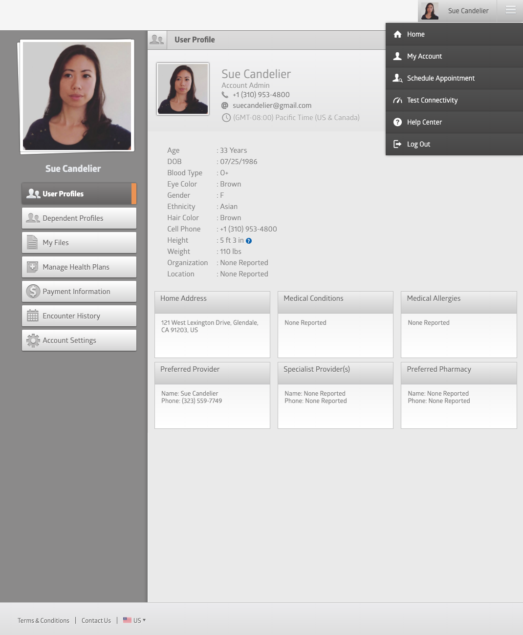
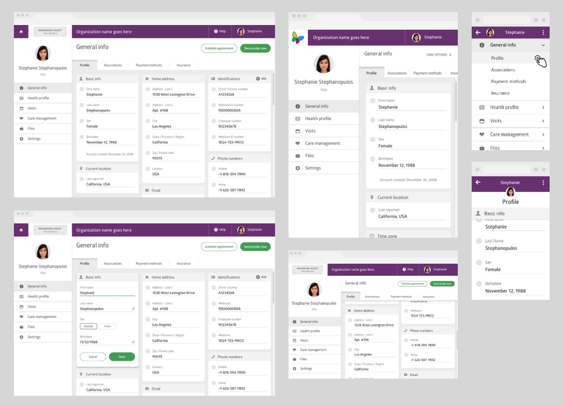
Is this the same app?
|
Once a patient goes in to manage their account, it appears very different and doesn't quite feel like you're in the same app. The organization name and brand color on the landing screen does not transition into these account management ones.
This lack of consistency doesn't instill trust. From a business perspective, it's a missed opportunity for an organization to brand this white-label app. Why wouldn't you want your org name and brand color on every screen?!? Accessibility issuesThere's a lot of gray on these account management screens. The gray text on gray background, as well as the small size of the type, makes it difficult to read.
The navigation menu on the left is also harder to read than it should be. The gradient buttons and recessed gray icons don't help. It doesn't match icon styles in the hamburger menu either! |
|
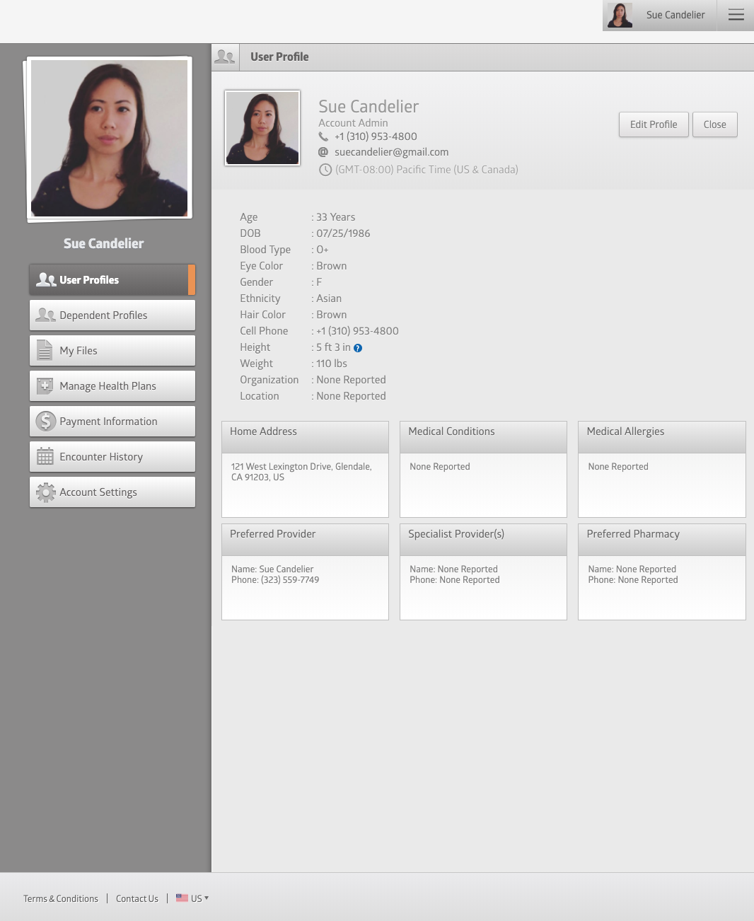
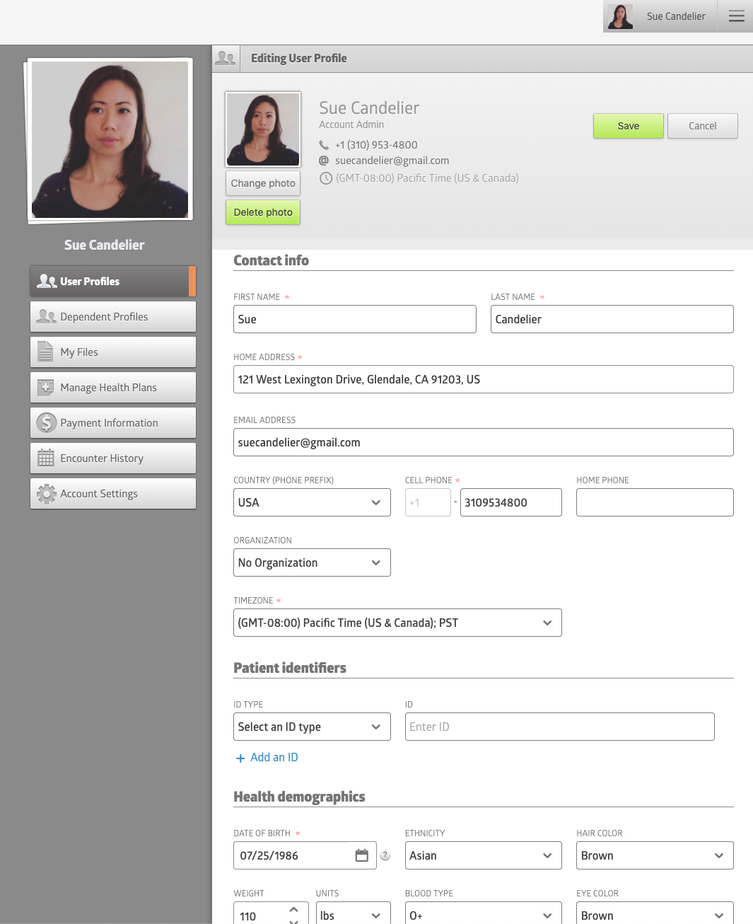
Editing can be easier
The process to edit your patient profile is very clunky. It's doesn't allow for in-line editing or even editing by sections. To make a small change, the patient has to click on "Edit Profile" and find that specific field again, make that change and go all the way up to click on that neon green "Save" button (color not used anywhere else in the app) in order to save changes.
|
|
Where can I schedule an appointment from my account?
There's no easy way to schedule an appointment again without hitting the hamburger menu on the top right. A one of the primary reasons a patient would log onto the app, this action is one that needed to be brought forward and clearly accessible, especially on a patient's or dependent's account.
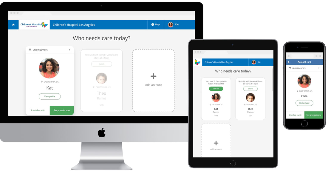
Redesign effort
|
When we got the green-light to overhaul the patient UI, we took it as an opportunity to design creative solutions for the many challenges listed above and greatly improve the patient experience.
As the design lead, I worked with one other designer, as well as our dev and QA teams to get this effort launched in less than a year. We outlined flows to make sure all requirements were accounted for, designed and iterated quickly with design reviews every couple of days.
Once designs were handed off, we took part in weekly calls with our dev teams in Panama and Russia (ungodly hours for all) and provided feedback on demos, to capture fixes before it got to QA. The design team also worked with QA to provide clarity on design intent, and wrote tickets for issues that needed to be fixed. |
|
Solution
|
We made some major changes to the patient UI. Some of the key efforts we took to create a better patient experience included:
|
|
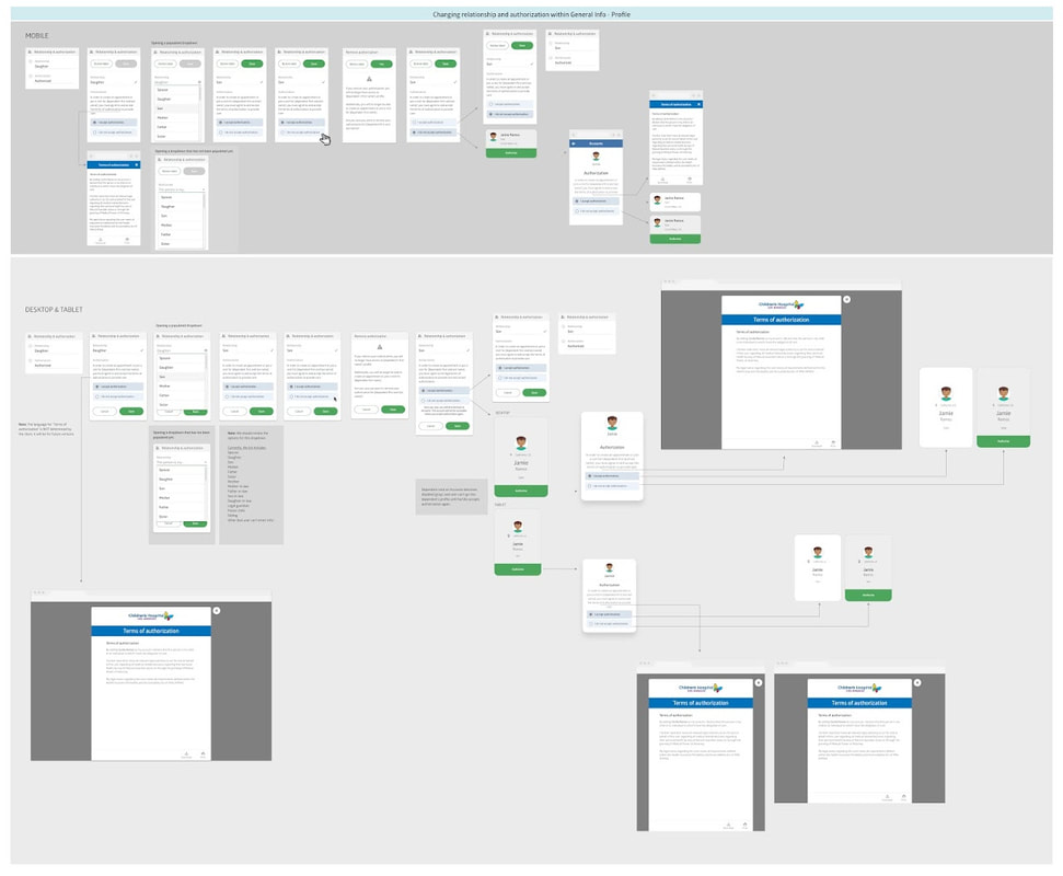
Dependent relationship and authorization
We had to work out flows for a number of complex functionalities on the app. One of them was in working with dependents, and determining a patient's relationship to to that dependent and providing self-attested authorization to provide care for them. There was also a flow for when a child reaches the "age of majority," which is different for different states, and how we handled that transition of control from the parent or guardian to the child, who becomes of age to legally manage their own medical information.
Editing flows
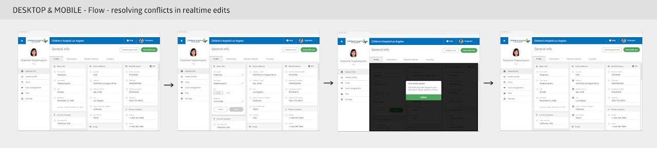
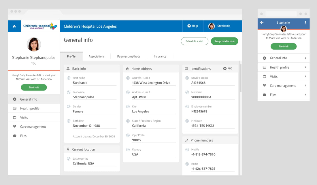
We wanted to provide the patient with a seamless experience when they switched from viewing to editing their information. We did so with dividing their information into section cards, which could be edited simply by clicking on it. Because the patient profile information is accessible AND editable by both the patient and provide/administrator, we had to think about resolving conflicts in inputs in realtime. The use of visual indicators on the left side of each field also gave the patient and providers information on who edited the field last.
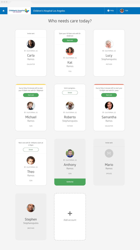
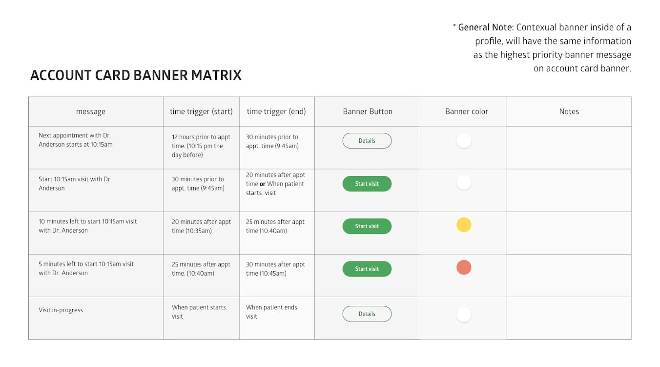
Contextual banners
The old UI did not provide a way to notify patient that they or their dependents have upcoming visits. We created a matrix with logic on when it would make sense to trigger a banner that appears on the patient card and and when their go into their account, making them contextual. Each banner had a specific color, message, and call-to-action button.
|
|
ReflectionsI'm very proud of the work we were able to do with this project. It was a mammoth undertaking; at times it felt like we were digging and uncovering more and more flows and functionalities that weren't taken into account in the old patient UI. There's a lot more than what is shared here.
As a two-designer team, we functioned effectively, rapidly ideating and iterating, and we developed good working relationships with our dev and QA teams. In the end, our design efforts greatly improved the patient experience on our platform. Clients were excited to see the new changes in production. We received positive comments from a number of clients through our Customer Success team. It was also gratifying to be recognized by our CEO for the work we did. |
Kudos"I wanted to send a brief note of thank you and congratulations to all that were involved in the significant project to rebuild the patient user interface in our Virtual Care Management platform. I reviewed it in detail this morning and it is beautiful, intuitive and robust in capability.
Congratulations to everyone: from concept development and requirements definition, to design, to engineering, to QA and usability testing, to launch preparation and client and user communications this was a large effort and it was well done. Thank you, thank you, thank you for all of your levels of professionalism and expertise having been applied to this project. For anyone who has not yet seen it, please log on and see this great piece of work." Dave Skibinski President / CEO, SnapMD Nov 2019 |

|
|

|
|