PROJECTChallenge: The OAA site had not been touch in a while...probably 5 years! The site had organically grown.
The nav menu was a mess, much of the content was outdated or inaccessible, and the site's main feature was confusing and hard to use. Our team was tasked with redesigning OAA's entire site for their 75th anniversary celebration within a 9-month timeline. Solution: Assess every piece of content on the site, and workshop with client on what stays, what goes, and what needs to be updated or added. Redesign navigation, content presentation, and main feature to increase engagement, usability, and accessibility. Propose a strategy for site maintenance and growth. |
ROLELead product designer.
I assessed how the site's content was structured and organized, and came up with a strategy to improve its information architecture, visual design, and interactive features. I designed a simplified navigation, new page layouts (with a clear hierarchy of info, engaging visuals and micro-interactions), and an intuitive search feature for their programs. I presented design solutions directly to the client, answered questions about design decisions, and iterated on designs based on feedback. |
CLIENTThe Office of Academic Affiliations (OAA) oversees the Veterans Health Administration's academic partnerships with medical schools, universities, and other healthcare training institutions.
Through these partnerships, more than 100,000 health professions trainees receive clinical training at VA each year. The OAA plays a critical role in building a pipeline of health professionals that are trained to better serve the needs of Veterans and the Nation. |
First, let's assess.
|
One of the first steps the content strategist and I took was to assess EVERYTHING on the site. Every piece of content--all the copy, visuals, PDFs (!) and interactive features.
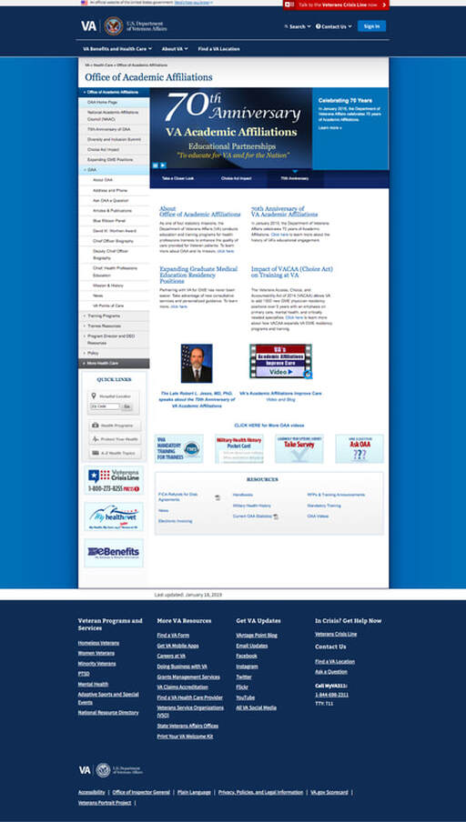
We workshopped with the client to determine what stays, what goes, and what needs to be updated or added. This was such a crucial initial step. Not only did we gain insight into just how much information OAA's site contained (so much nested content!) but we began to understand, from our stakeholders, what the most important and most relevant info was to our site visitors. We also learned that the client wanted the new OAA site to have the same government look and feel as the old site, so the main focus of this redesign was not going to be visual. It was the information architecture! Redesigning the site's information architecture (IA) was going to be the key to increasing its engagement, usability and accessibility. |
|
Prioritize and organize
|
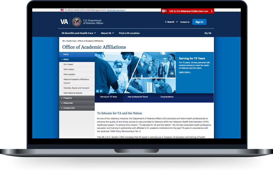
We streamlined the content to focus on the most important information. I redesigned the navigation to reflect these priorities. I also revamped the presentation of the content on prioritized pages and sections to make the information more engaging and easier to digest.
This is where I dug into supporting visuals (videos, data visualization, photos, etc.) and copy. Aiding by the Plain Writing Act of 2010 which requires federal agencies to write “clear government communication that the public can understand and use,” I focused on simplifying sentences, eliminating jargon, breaking down acronyms, and using easy-to-understand words. Now, about that nav menu...With 22 main menu and 98 sub-menu items, the navigation structure on OAA's site was excessive and overwhelming. It was too much, making it hard for users to access and explore the different sections and pages on the site.
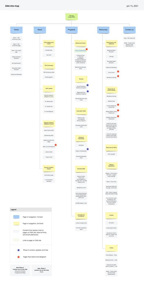
To make the site's navigation menu more user-friendly, our team led several bucketing exercises, where we worked with the client to understand what information should be presented at what level. I created a site map as a visual to guide our discussions and decisions. By the end, the navigation menu went from 22 to 5 main menu items, and from 98 to 17 sub-menu items. Big improvement. Streamlining the site's information and simplifying its nav menu made it so much easier for users to navigate through the site's content and find what they're looking for. |
The main feature (and its UX issues)
|
The two most popular sections on OAA's site are where users come to search for (1) Nursing Residencies and (2) Advanced Fellowships. Both programs used the same filter and search feature on their respective pages.
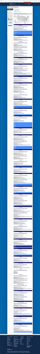
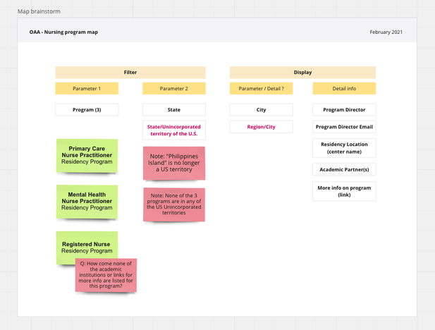
So why did the feature need to be redesigned? On top of the nursing page is an outdated map of the US with its unincorporated territories titled "Where are our VA Nursing Practitioner Residency Programs located?" The purpose of the map is to show the breathe of all the nursing programs, but it only showed all the states and unincorporated territories in gray. Not a great representation. It was actually an inaccurate representation, as none of the nursing programs were available in unincorporated territories. The map also included the Philippines Island, which is no longer a US territory. Under the map, the states were listed in a horizontal bar in alphabetical order. When clicked on, these bars expanded to show the nursing programs underneath it. But there was no "expand" or "collapse" visual indicators. The bars simply changed colors if expanded. Also, if the state didn't have any programs underneath it, users receive no feedback when they click on it. Nothing happens. The bar simply remains the same color, but there is no other feedback. There was no filters for users to find the specific nursing program (3 total) they're looking for. Users had to click on each state bar to see if the program they were looking for was there, if any were listed underneath at all. What a pain point! And if users were looking into programs in Wyoming, they'd be scrolling for a while. Make it make sense.The process to find a program was cumbersome. It required a lot of clicking and scrolling. To solve for these pain points, I created a diagram of the filter parameters and the information for each result to display.
|
Mock-ups to reality
|
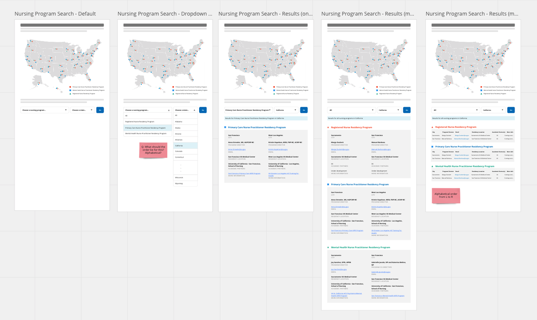
After analyzing the information, I came up with a simple solution that entails a dual filter search function based on the program and state the user was interested in.
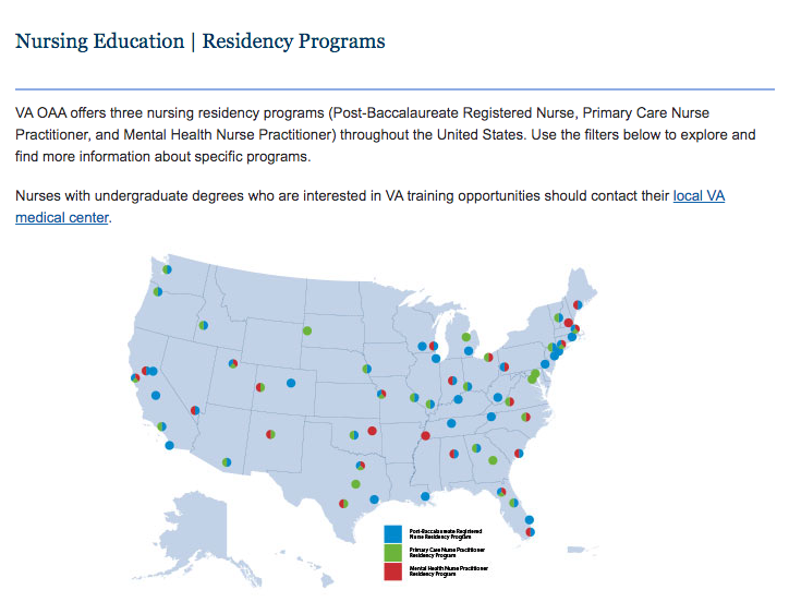
Search results displayed only the program(s) within the specific state selected, and in a visually easy-to-digest way. The map was redesigned to show which states the three nursing programs were located, and in different colors and shapes for accessibility; for users who may be color-blind. Lastly, I worked on a brief description of the map and the program search tool to introduce users to what they could do on this specific page. As a result, users were a lot more clear on what the map represented and how they could use the search feature to find a nursing program. |
|
RESULTS
We successfully launched OAA's redesigned site in three phases within a 9-month timeline. By streamlining the information on the site to only the most relevant and important, the content is now more engaging, accessible, and clear. The restructured navigation also enhanced the user experience of the site, allowing users to explore and get to what they're looking for quickly and easily. And the redesigned search feature for OAA's core programs will make a direct impact on the health professional trainees they are trying to engage.
The site redesign was well received by the client. The OAA gave our team the highest ratings on every measure for the Contract Performance Assessment Report (CPAR) for this project.
The site redesign was well received by the client. The OAA gave our team the highest ratings on every measure for the Contract Performance Assessment Report (CPAR) for this project.
|

|
|

|