|
COMPANYSnapMD is the full-service Virtual Care Management (VCM) telehealth enterprise-level software, enabling healthcare providers to engage their patients via a comprehensive, secure, HIPAA-compliant, cloud-based telemedicine platform with powerful back-end systems to manage the digital health care continuum.
(Acquired by VirTrial, a Kinderhook Industries company in Oct 2019; then acquired by Signant Health in Nov 2020) |
Video encounters
|
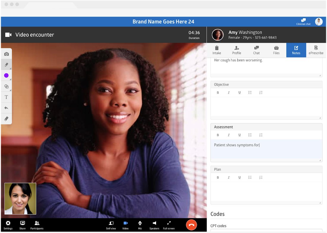
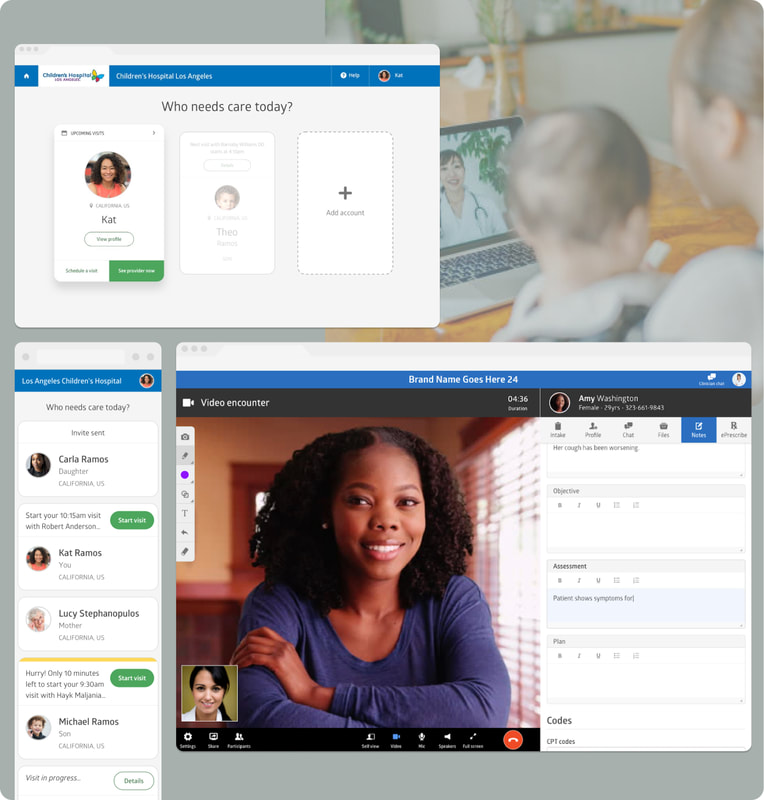
SnapMD's tele-health platform gave providers the options to connect with their patients through chat, phone, video, and in-person. We call these different types of ways of connecting "encounters."
I refined the "video encounter room" to make it as easy to use as possible, while integrating all the essential tools providers needed to have a successful encounter with their patients. This UI is complex! It included all the video call capabilities you'd expect from apps like Zoom, in addition to features on an electronic health record (EHR) system. |
|
Timing is everything
|
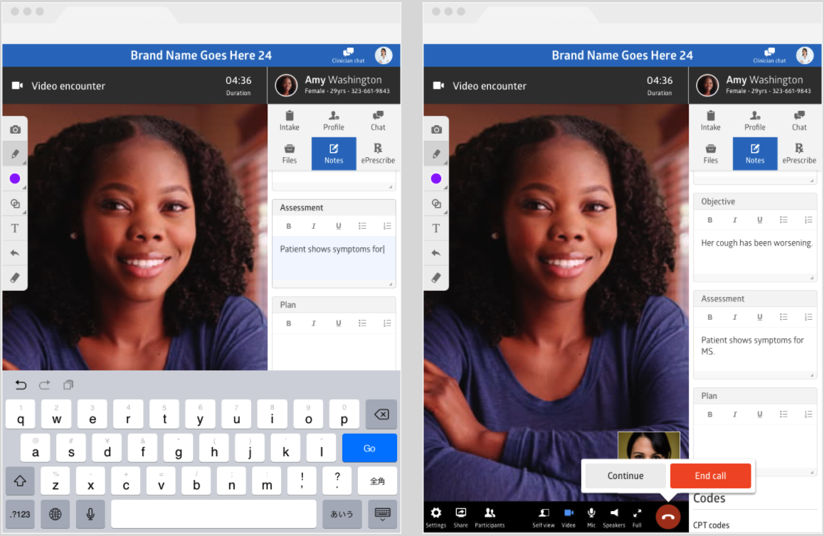
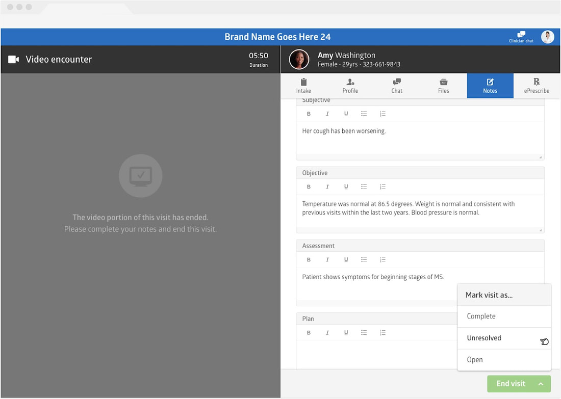
One of the specific problems I tackled affected the provider's workflow: How do we end the video call with the patient without ending the encounter itself?
A timer starts once the patient joins the video call from the waiting room. The providers wanted that timer to continue, even though the patient may have "left the room," as they finished up with the patient's chart (e.g. reviewing files, typing up their notes, etc). This was important because the length of the encounter affected billing. These designs were the design solutions I worked on to let providers end the video portion of the call, and continue with notes before marking the visit as "Complete," "Unresolved," or "Open" (a status that affects another provider workflow) and ending the visit. |
|
Care management
|
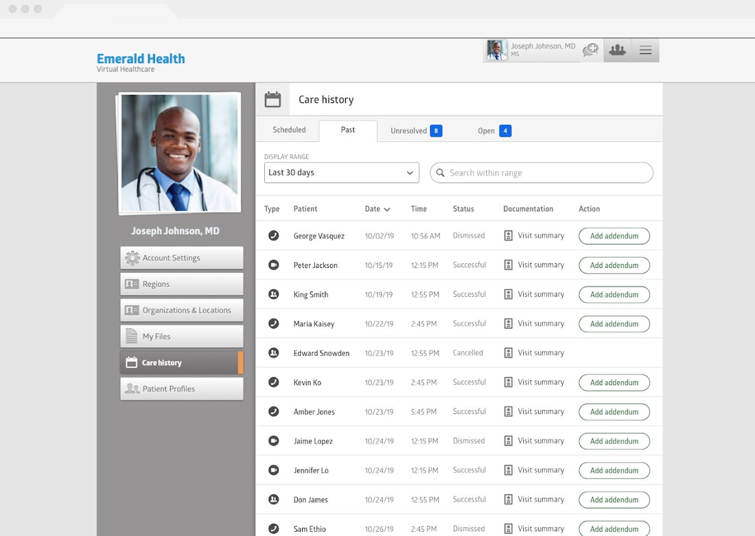
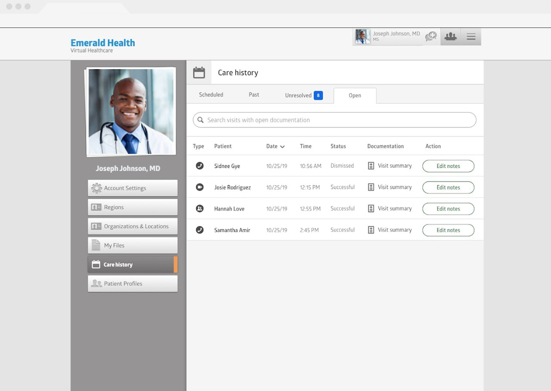
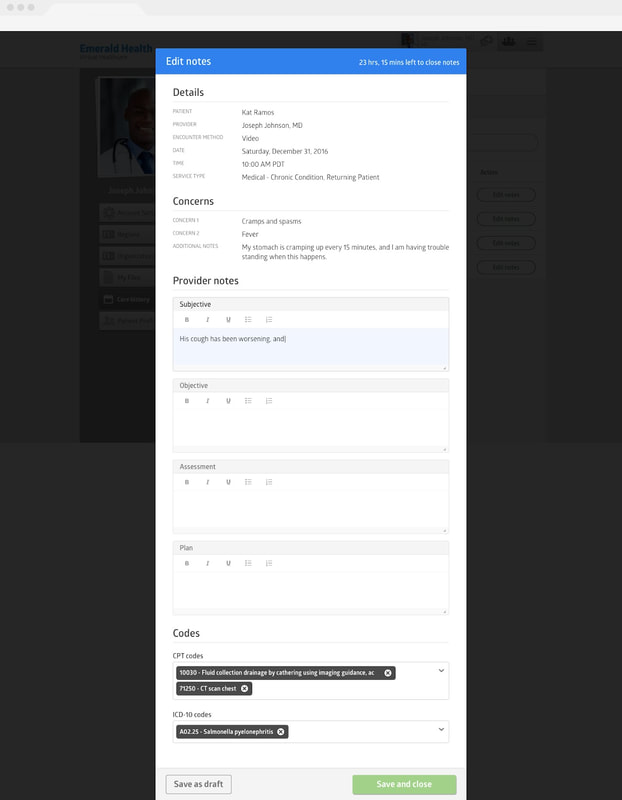
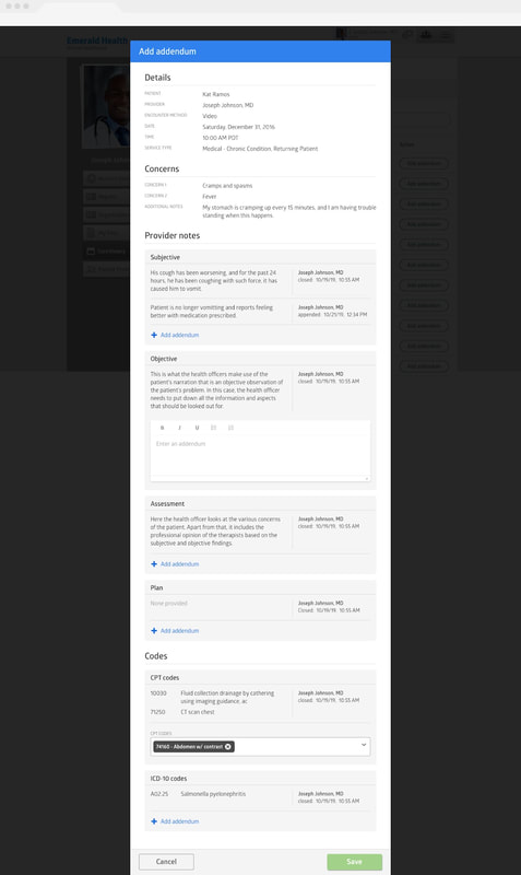
Providers needed a way to manage various categories of visits, including those that are scheduled, past, unresolved, and open.
I created tabbed list views for each of these categories. Under each were unique actions that the provider could take. The first example below shows that the provider can edit notes of the open visits, and what that looks like when it's expanded. The second example shows that a provider can add an addendum to notes from past visits. |
|
|
|
Patient profiles
|
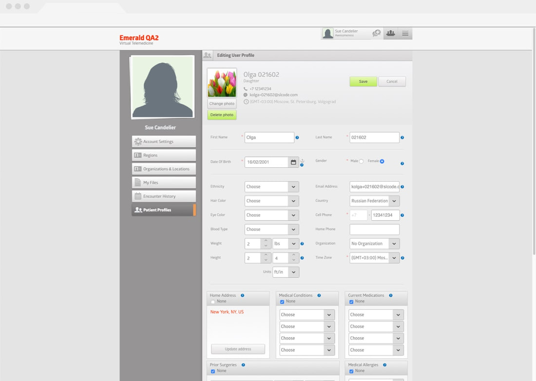
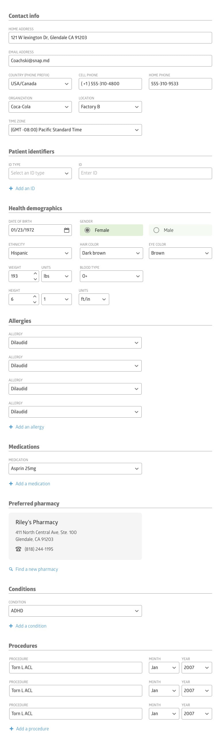
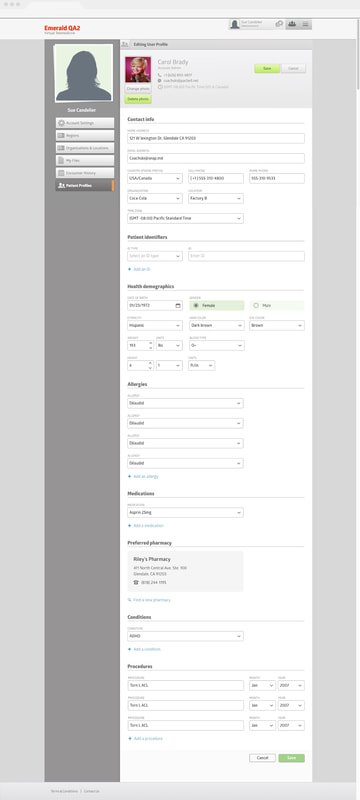
Our design team was hired after the product had been pushed out already and, unfortunately, without much thought to design.
This meant a lot tech debt and a design challenge. Instead of designing on a blank canvas, our team had to design within constraints of a legacy app to improve its user experience, bit by bit. One part of the legacy design that I took on was the provider's edit view of the patient's profile. The original version (on the left) was very dated and confusing. It also didn't give providers sufficient space to add information. For example, there was no way to add more than four medical conditions. In redesigning this, I focused on information architecture and increased usability, including the visual layout and ability to add new information. |
|
Preferred pharmacy
On the platform, providers have the capability to add information and make edits in patient profiles.
I worked on the module that gave providers the ability to add a preferred pharmacy into a patients profile. This included designing a pharmacy search with zip code and radius filters.
Since this modal design was a new one within our design system, I also took into consideration important interactions (e.g. scrolling, loading, and empty state) to ensure consistency with other core components within our app.
|
|

|

|